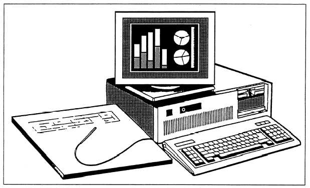
Figure 14-17.—Computer graphic system.
A computer graphic system is shown in figure
All copy or lettering must be readable. Fancy fonts
14-17.
PREPARING TELEVISION VISUALS
LEARNING OBJECTIVE: Identify the
techniques used to prepare television visuals.
Regardless of the purpose or format of your
television visual, you must consider the following basic
aesthetic elements:
l Simplicity
l Contrast
l Balance and composition
l Lettering
SIMPLICITY
The old adage, “Keep It Short and Simple” (KISS),
certainly applies when you create television visuals.
Your visual should be uncomplicated and easily
recognized. Do not make the viewer work too hard to
understand what he is seeing. For example, viewers
normally will ignore a visual with too much lettering.
Additionally, try to keep colors to a minimum.
may look good on paper, but they might not permit the
viewer to understand what you are trying to convey.
Sizing of the subject in the picture also is important.
“Keep the primary subject somewhat large within the
picture that you are framing. Do not make the viewer
strain to read or see the subject. A good subject size is
about one-half inch in height on a 19-inch monitor.
CONTRAST
High definition, or contrast quality, is important for
reproduction over a television system. Contrast in
visuals should be sharp but not excessive. Avoid large
areas of white. The pickup tube(s) of the camera will
transmit glitter and flair when you shoot high-intensity
reflected light, especially during camera movement.
This also may introduce audio noise into the television
picture.
The human eye can identify about 100 different
shades of gray. The television camera clearly identifies
only about 10 shades. Since the brightest area can be no
more than 20 times as bright as the darkest area, you
must be careful when using pictures and visuals that
have high contrast.
You also should consider how color will appear on
a black-and-white (monochrome) television set. Color
material will appear as shades of gray on a monochrome
14-18


