When a series carries only the family name, with no
adjectives indicating variations in width, weight or
angle, assume that the type is normal. The usual
distinction is between big letters (called display or
headline type) and small letters (called body or text
type).
Type Font
Type font is the next category and has all the letters,
numbers and characters necessary to set copy in one size
of type. However, a modern newspaper uses either one
or two families of compatible type to achieve variety in
the series choice and point size.
INITIAL LETTERS
Initial letters are large, ornate capital letters that are
sometimes used at the beginning of a paragraph to dress
up the page and add white space. They come in all sorts
of styles. When an initial letter is used, the remainder of
the word it begins is generally capitalized. You may use
either regular capital letters or slightly smaller capitals
of the same style of type.
ORNAMENTS
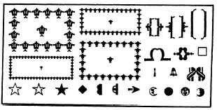
Ornaments, such as stars (called “dingbats” in
publisher’s lingo) and dots (called “bullets”): are used
to add interest and beauty to a job. When using
ornaments, you should always select something that
goes well with the style of type you are using. Above all,
do not overdo them. Fancy types and decorations should
be used only if they make your newspaper page more
effective. Decoration, just for decoration’s sake, was
abandoned at the turn of the century in favor of simple
harmony and balance.
BORDERS
You should select borders with the same care you
use to select a typeface, because the same general
principles of typography apply. Figure 8-17 shows some
typical ornaments and borders.
A study of type size and classifications could take
up an entire book. The basics presented here will help
you both in preparing an attractive publication and in
conversing with the publisher. For all practical
purpose, all you have to know is the answer to the
question, “What kind of type is available tome?” A trip
to your publisher or local printshop will give you that
answer.
8-18
Figure 8-17.—Ornaments and borders.
NEWSPAPER MAKEUP
LEARNING OBJECTIVE: Recognize the
objectives of ship or station newspaper makeup
and the techniques used to meet them.
“Newspaper makeup” is defined as the design of a
newspaper page or the manner in which pictures,
headlines and news stories are arranged on a page. The
objectives of newspaper makeup areas follows:
. To indicate the importance of the news
l To make the page easy to read
l To make the page attractive
FRONT-PAGE FOCAL POINT
Each page of a newspaper has a focal point — a
point on the page to which the reader normally looks for
the most important story. Any area can be the final point,
depending on the chosen design. Advertisements can
also dictate the focal points of the inside pages of a
newspaper.
On the front page of some daily newspapers, the
focal point is often in the upper right-hand corner a
now-dated practice that reflects the style of a bygone
era. Americans, although trained to read from left to
right and top to bottom, greatly altered this pattern for
many years with respect to their newspaper reading
habits. Through the use of banner headlines that
extended more than half the width of the page, readers
were trained to seek the upper right-hand corner of the
front page. Newspaper readers begin their reading by
following the banner headline across the page and
continuing down the right-hand side of the page.
Therefore, many newspaper readers have come to
expect the most important story in each issue to appear
or touch in the upper right-hand corner of the front page.
The right-hand focal point is not as important to
makeup editors as in the past, since fewer newspapers
use banner headlines on the lead story. However, many


