ROMAN.— Roman is the type most commonly
used for the text of magazines, newspapers and books.
It is chosen because most readers are familiar with it and
Because it is the easiest to read in smaller sizes and in
lengthy articles.
Roman types are divided into two classifications:
modern and old style. The chief difference between
modern and old style reman is found in the serifs (the
small cross strokes at the ends of the main lines of a
letter). The old style letter has soft, rounded serifs, while
the modern letter has heavier shadings and thin,
clean-cut hairlines.
GOTHIC.— Study the difference between the
reman letter and the gothic letter in figure 8-15. You will
notice that where the reman letter is composed of a
series of thick and thin lines, the gothic letter is
constructed of lines of even weight. It has no serifs
(known in the printing profession as “saris serif”); it is
perfectly plain. Gothic type is popular for use on posters
and as headlines.
TEXT.— Text type is sometimes referred to as “Old
English.” Text was the first type style used in the history
of printing. Although it is still used frequently, it is
generally limited to a few lines of copy. As far as
newspaper work is concerned, it should be limited to
something formal, such as religious announcements,
prayers, programs and invitations.
ITALIC.— In italic type, the letters are slanted and
made to match almost every reman, gothic and
contemporary type style in use today. Italic is used in
text matter to show emphasis. Although italic was
originally used for text, it was rather hard to read in
lengthy articles and it is seldom used for this purpose
today.
SCRIPT.— Script typefaces have little connecting
links, or kerns, that combine the letters and give them
the appearance of handwriting. Script is suitable for
announcements and invitations.
CONTEMPORARY.— The past 50 years have
been highly significant in typographic history. The old
gothics have had their faces lifted, and new streamlined
faces have appeared everywhere. Contemporary type
refers to the thousands of modern, artistic faces used in
a variety of ways, such as advertisements, labels on cans
and boxes, display composition and television
commercials. The example of contemporary type shown
in figure 8-15 is bold (heavy block), but the same group
contains lightface letters. In general, modern types
feature more lightface than bold.
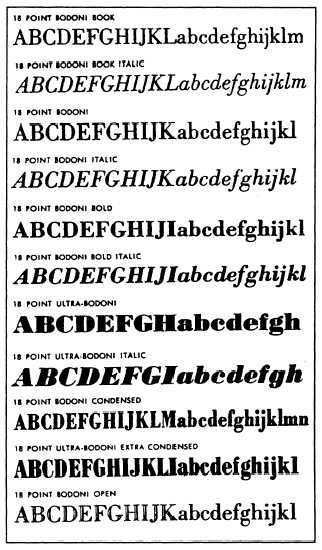
Figure 8-16.—Various typefaces in the Bodoni family.
Type Families
From classes, type is further categorized into
typefaces that are similar in design, though not exactly
alike. These groups are called type families. Each type
family has a name and a certain basic family
resemblance. Many type families are named for their
creators, such as Bodoni and Goudy. Some names come
from regions or nations: Caledonia and Old English.
Some type families include dozens of typefaces, all
different in some way, yet all having general
characteristics that unmistakable y identify them as
members of their particular family, such as the Bodoni
family in figure 8-16.
Type Series
The next type category refers to the weight, width
and angle of type. This category is called type series.
8-17


