CUTLINE TYPOGRAPHY
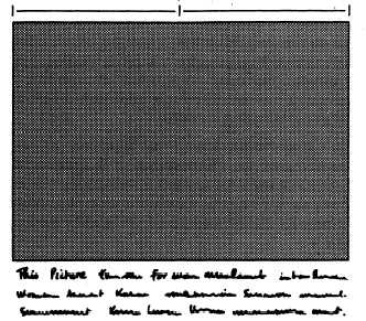
Figure 9-15.—Cutline set two columns wide.
There are several ways of crediting photographs.
Some newspapers and magazines give photographers
personal credit lines (this is encouraged for ship and
station newspapers). Others use a blanket statement
which states, for instance, that “all photos are U.S. Navy
photos unless otherwise credited.” However, the
recommended way is to put the credit line at the end of
the cutine itself. The credit line should follow the last
word of the cutline, in parentheses in the following
manner: (U.S. Navy Photo by JO3 Evelyn Grudge) or
(U.S. Navy Photo).
If you are writing cutlines for external release, do
not concern yourself with the way the cutline will be set
in type. However, if you edit a ship or station newspaper,
you will need some knowledge of cutline typography.
Good cutline typography heightens the impact of a
photograph by making the explanatory text as visually
appealing as possible. It is a good idea to rewrite and
reset Navy Editor Service (NES) cutlines, because they
may violate your local style, and the typefaces used may
not match yours.
For better display, cutlines are usually set in a larger
or a different typeface than that used in the news
columns. Some papers use the same size and style as
their body type, except that it is set boldface.
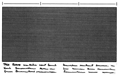
Cutlines under multicolumn photographs are best
displayed when set two columns wide for two-column
photographs (fig. 9-15) or a column-and-a-half wrapped
for three-column photographs (fig. 9-16). The term
wrapped means to place two or more columns of type
side by side under one heading or piece of art. Cutlines
should not be set wider than two columns.
Captions
The word caption, while often used as a synonym
for the word cutline, has a second meaning. It is a small
headline, or display line, sometimes used with cutlines.
Figure 9-16.—Cutline for a three-column photograph set a column and a half wide.
9-16


