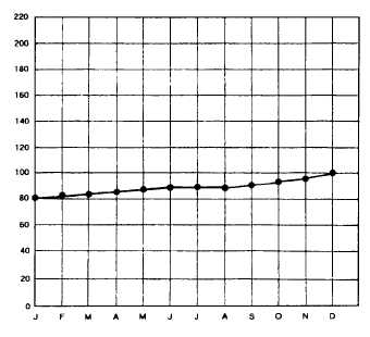
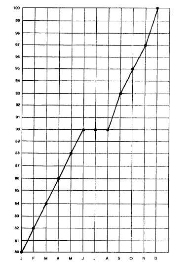
Figure 9-5.—Obscuring results.
no need to hide the data from anyone by making the scale
too hard to see such as in the first graph produced. There
also should not be any of the surveyor’s personal
interests involved in choosing the method of display.
The data should be presented with only the com-
munication of the facts as the goal.
Given that the CO was astute and, being an engineer,
well aware of statistics and their uses, how creditable
would the JO sound when bragging about the
advertising campaign for the racquetball courts and how
the TAD upset that campaign? What if the CO was a
racquetball player and knew how hot the courts were in
the summer? Would the credibility of the JO then come
into question? Of course it would!
The lesson on graphics is simple. Use whatever
visual communication device you need to get your
message to its intended audience. Nevertheless, beware
of making the data look suspect by taking too many
creative liberties. Remember, many in your audience
will be as good of a statistics consumer as you now are
Figure 9-6.—Suitable display.
Figure 9-7.—Exaggerated results.
and once the data becomes suspect because of an
obvious attempt to manipulate the figures, your
credibility is gone and your efforts have been wasted.
SUMMARY
This chapter is part of the JO 1 & C training manual
because of the growing demand from the public affairs
community and the ongoing need of internal media
relations to know what is happening and to know their
audience. Survey production and analysis have only
recently been included in the occupational standards for
journalists, but it has long been a part of the rating.
AFRTS and, since 1975, NBS, have always required an
annual audience survey. More and more public relations
practitioners in the civilian world are having to prove
their worth on the bottom line to their chief executive
officers (CEOs). Proving the money value, more often
than not, entails sophisticated statistical analysis of
program effect.
9-11


