Graphs
You can make the presentation of statistical material
clearer, more vivid and interesting by the use of
well-planned graphs. Subjects, such as the growth of
manufacturing in the United States, the breakdown of
our budget dollar or comparisons of living standards, are
best presented with graphs. They require very little
special skill in presentation.
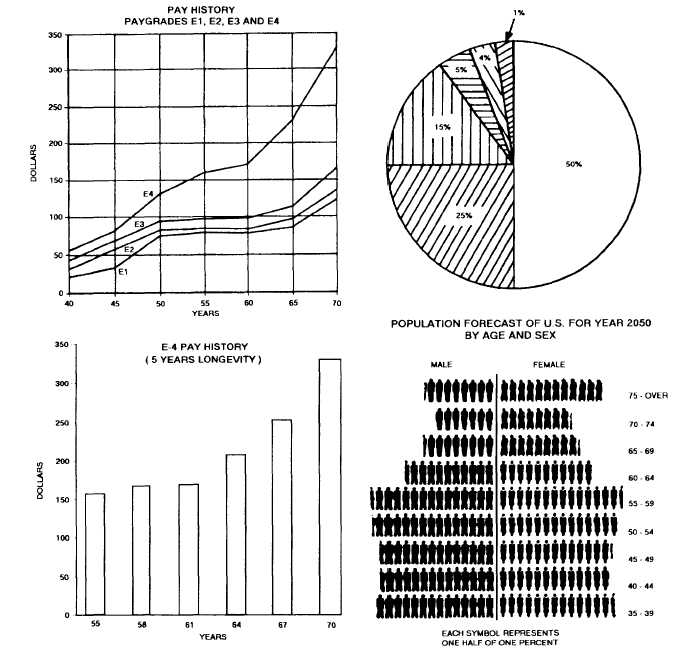
Most graphs fall into one of the four categories, as
shown in figure 6-4. These categories are as follows:
The line graph is used to demonstrate trends and
changes that take place in such items as income and
population.
The bar graph is another type used to show
information of a comparative nature. The major
difference between the bar graph and the line graph is
that the former need not show any passage of time.
Figure 6-4.-Line, pie, bar and picture graphs (GRAPHS FOR DISPLAY ONLY).
6-19