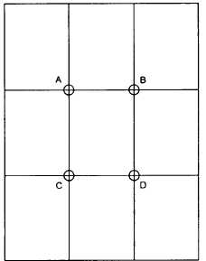
Figure 7-3.–Rule of thirds.
will result (fig. 7-1). When the eyes are looking too far
away from the camera, a vague, faraway look results
(fig. 7-2). The eyes also lose their brilliance and sparkle,
and too much white shows when the subject’s eyes are
looking away from the camera.
Portrait Composition and Subject Placement
As in every type of photography, in portraiture there
must be one, and only one, principal point of interest.
Naturally, in a portrait, this is the subject’s face. You can
emphasize the point of interest in a portrait by doing the
following:
Having it contrast with the background
Giving it the strongest lighting
Posing the subject and arranging the props so all
elements point to it
Locating it at a strong point within the picture
area
Where are the strong points within a portrait picture
space? The principle of thirds, as discussed in chapter
5, applies to portraiture as well. These are the areas
within a portrait that attract eye attention and are the
preferred locations for the center of interest (fig. 7-3).
In a portrait, when the main point of interest is located
at Point A, the secondary point of interest should be at
Point D. If B is the point of interest, C becomes the
302.159
Figure 7-4.–Subject placed too high in the photograph.
secondary interest point. Such an arrangement
obviously balances the composition.
As stated earlier, the subject's face is the point of
interest in a portrait and, of course, covers a considerable
area in the picture space. Usually in portrait
composition, the eyes fall close to Points A or B. But
these positions are approximations only. The final
adjustment of the head depends upon several factors:
the eye direction, the shape of the body, and the leading
lines. No rule can be given for best portrait composition.
Rules only give guidance to a rough approximation of
good placement. You can only arrive at the best
composition for each portrait through the feeling for
balance and subject position.
When the head and shoulders are placed high in the
picture frame, a sense of dignity and stability is gained.
Such placement is particularly appropriate when the
subject is a person of importance, such as the CO.
However, when the head is too high (fig. 7-4), viewing
the picture is uncomfortable because there is a feeling
that if the subject stood up he would bump his head.
Also, when the head is too high, the proportion between
head and body areas becomes awkward.
7-7


